Intro
This project is you will start to loosen up your drawing and try to convey more emotion.
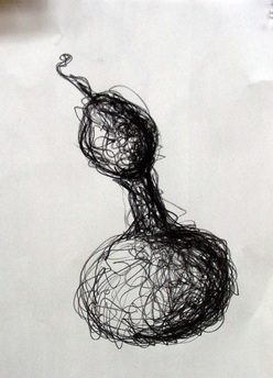
Image source fryeart1-weebly-com
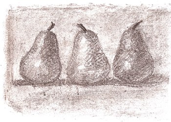
This is a drawing in which the artist has built up the value, or tone, by using more and more lines in some areas to convey to the audience a scene of depth and realism.
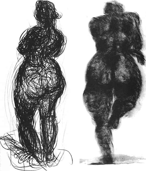
Image source www-joshuanava-biz By Joshua Nava
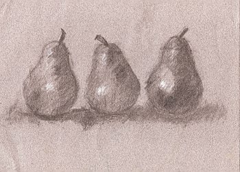
Often in class, we talk about ‘weighted lines’ in the drawing above and below not only convey a sense of where light is coming from but also the physical weight of the person.
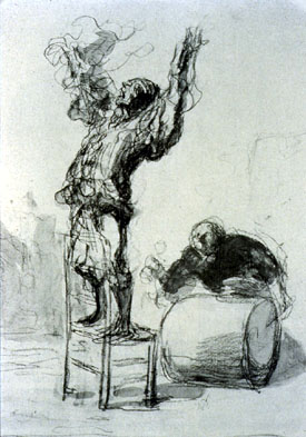
Image source rightbraindraw-blogspot-com By Rembrant
And there are even many Beautiful Non-objective massed line drawings:
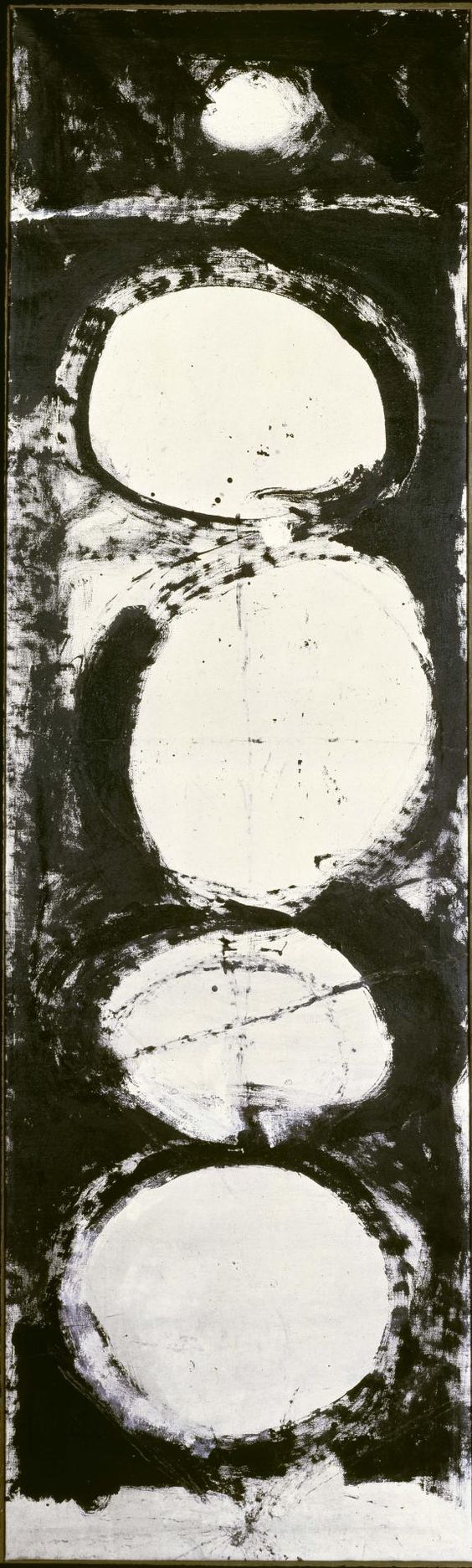
Image source Rauschenberg foundation-org-visit by Robert Rauschenberg
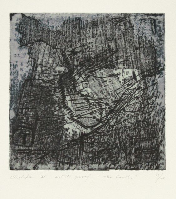
Image source annexgalleries-com-visit By Bernard Childs
But the drawings that I want you to focus on and try and find something in to spark your own work is the hauntingly beautiful drawing of Georges Seurat [France 1859-1891]. For Biography click here
Images by Georges Seurat
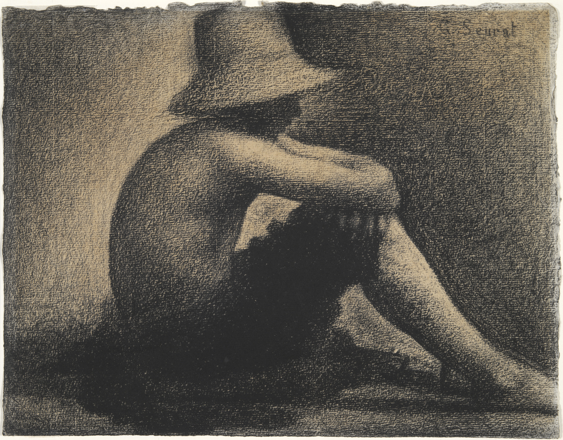
Image source historyofdrawing.com
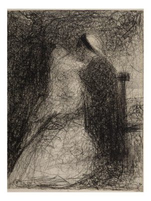
Image source 1www-galerie-creation-com
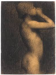
Image source www-sothebys-com
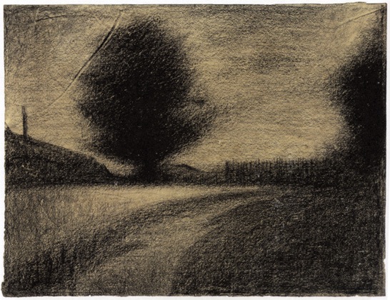
Image source www-nytimes-com
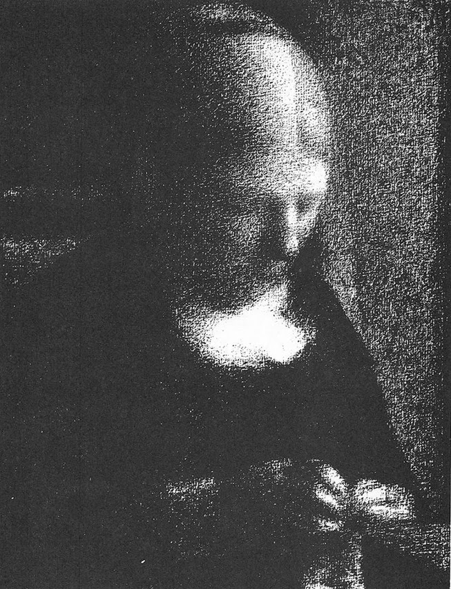
Image source www-ingetang-com
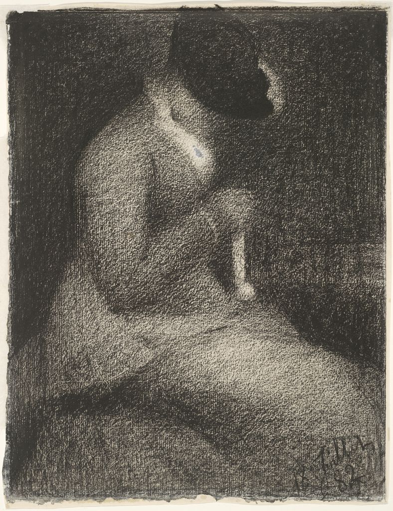
Image source www-harvardartmuseums-org
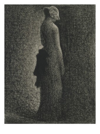
Image source Image source
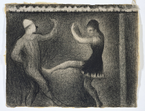
Image source paulgillisstudio-tumblr-com
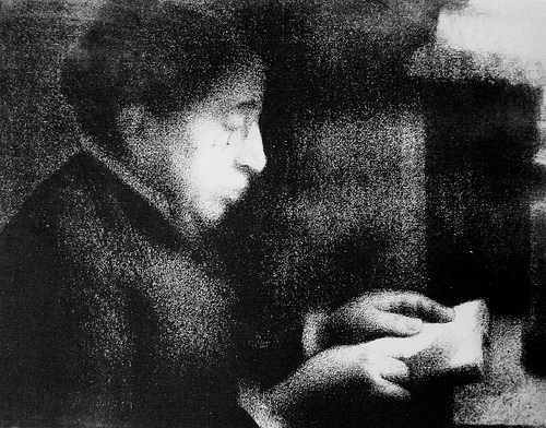
Image source practiceofpainting-wordpress-com
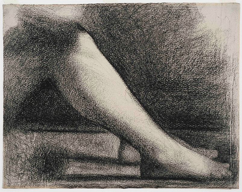
Image source www-alaintruong-com
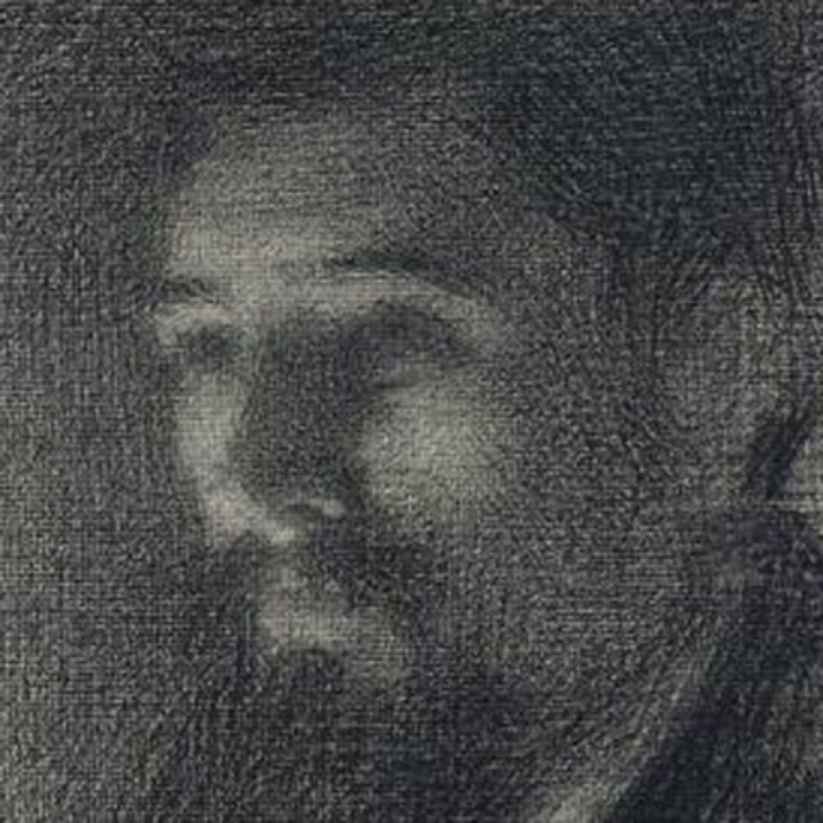
Image source www-biography-com
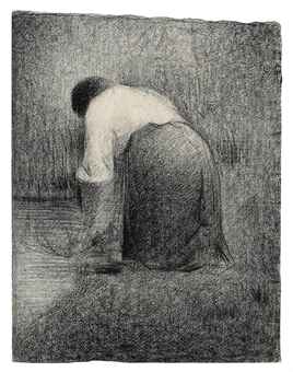
Image source www-christies-com
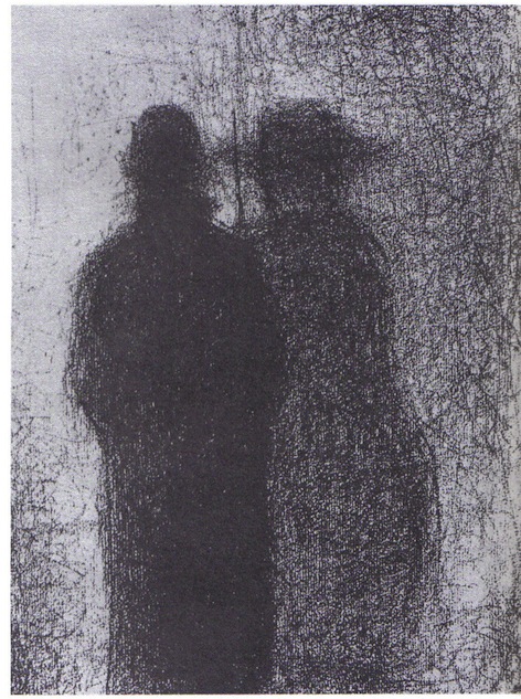
Image source www-fabula-org
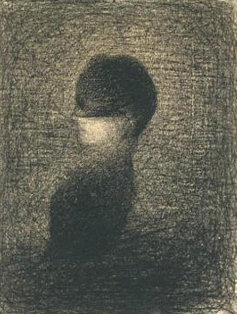
Image source dantebea-com voilette-1883
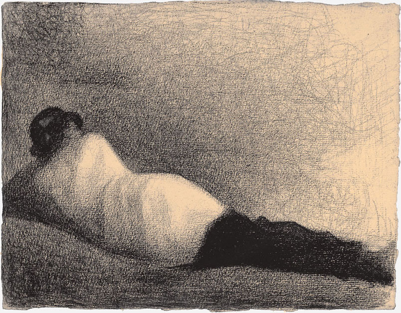
Image source arttattler-com
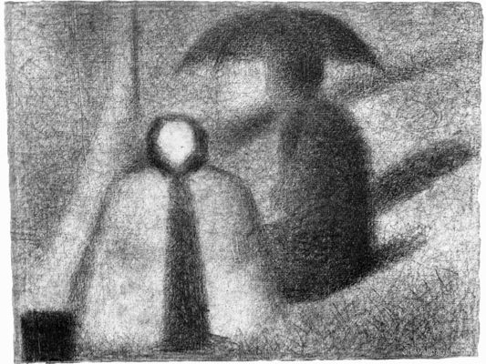
Image source aasavina-free-fr
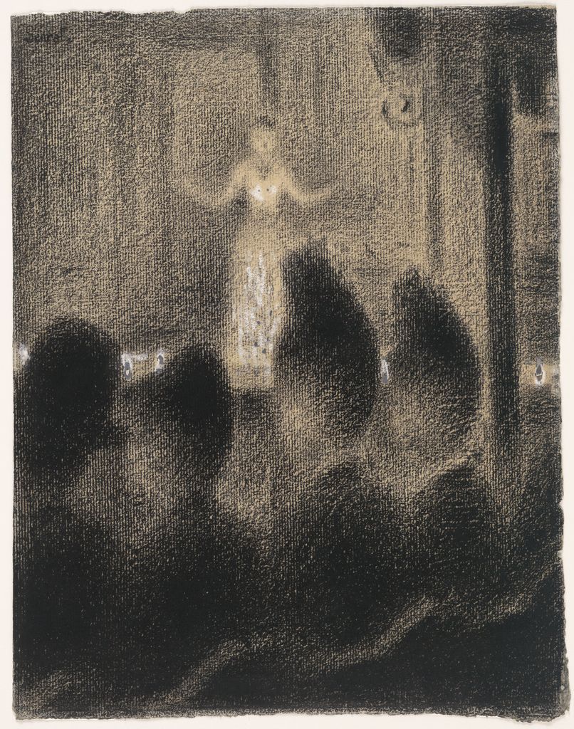
Image source a-votre-sante-tumblr-com
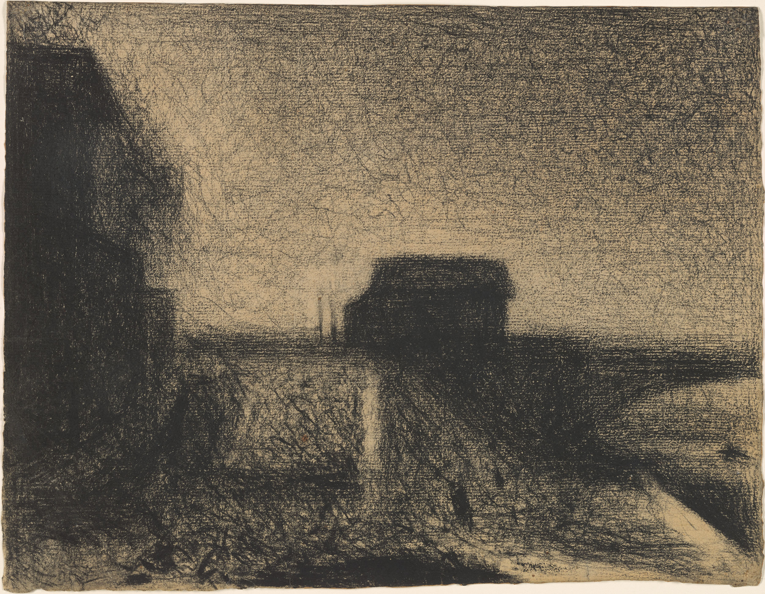
Image source www-themorgan-org
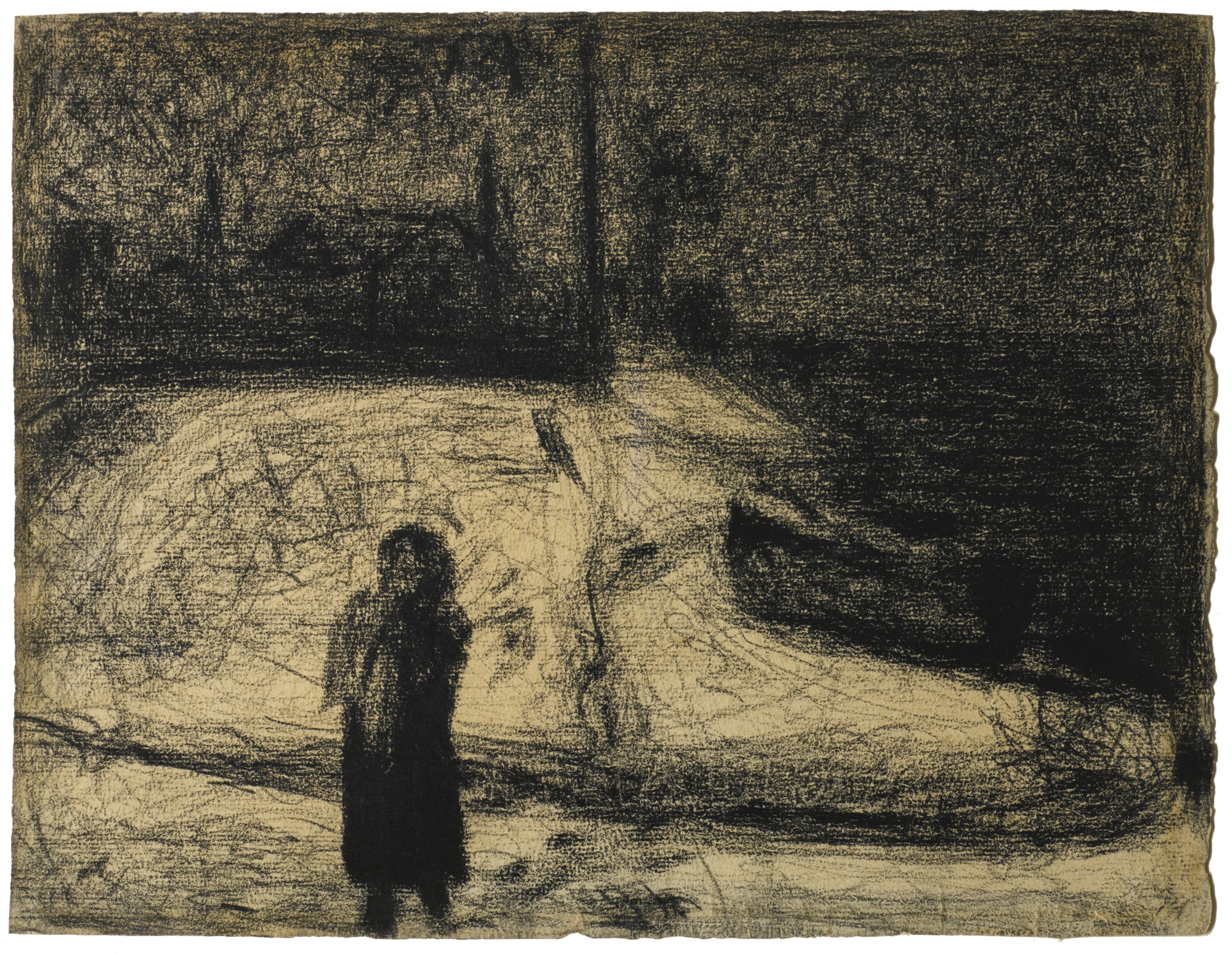
Image source
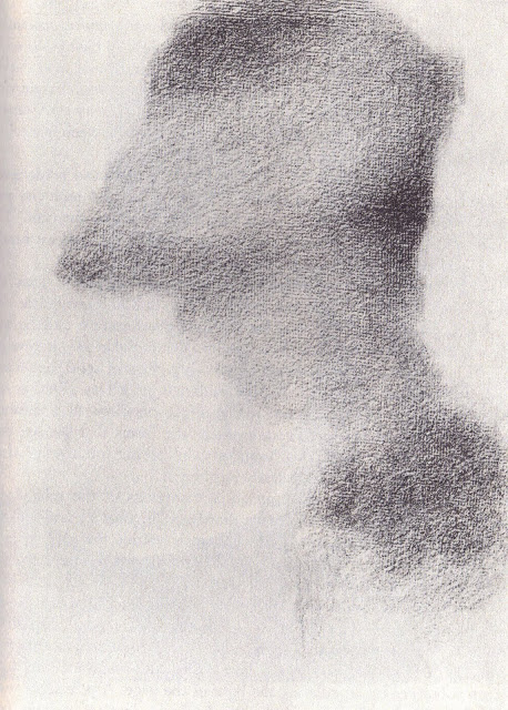
Image source 1seurat-tumblr-com
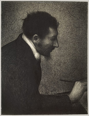
Image source www-metmuseum-org
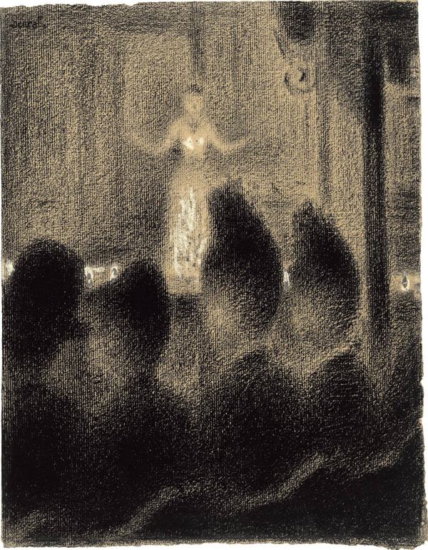
Image source arttattler-com
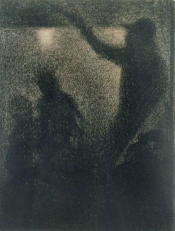
Image source daniellebellucci-tumblr-com
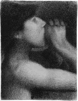
Image source elephantaday-blogspot-com
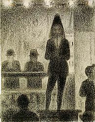
Image source en-wikipedia-org
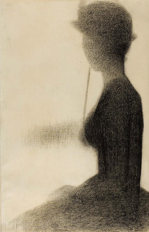
Image source fineartamerica-com
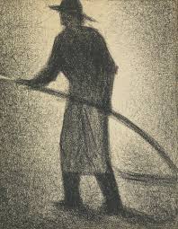
Image source jslaterfineart-com
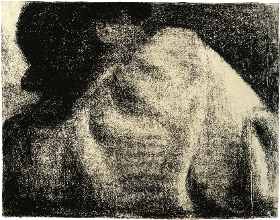
Image source morgan-leigh-tumblr-com
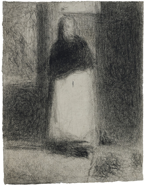
Image source seurat-tumblr-com
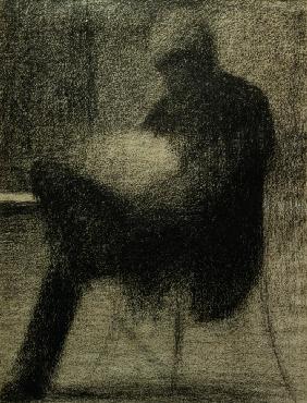
Image source daniellebellucci.tumblr.com
G.Seurat, Sitzender Mann (..) lesend
Berggruen collection.
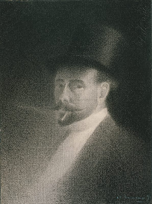
Image source www-metmuseum-org Self-Portrait
The Eggman:
I found this Homage to Seurat ondeviantart.com

Image source the eggman03.deviantart.com By the Eggman
How to begin:
After looking at Seurat’s images lets try some simple sketching (I’m thinking about 5-10 4×7″ sketches) of things we have around us- people, simple objects, places in the school, the upper part of the learning commons.
I would like you to keep at least three of these sketches (5×7″) for your sketchbook- please glue them in.
Once you have some practice and a feeling for what you’re doing take some picture on your phone. The subject is your choice-
DON’T BE LAZY!!! Think about what you want to do. Find the right subject/model. Think about the composition. Think about the positive and negative spaces. MOST IMPORTANTLY think about the light!!!
Choose three and print it out- these will be your ‘drafts’. You can use them to produce your good copy works.
We will agree upon a date on which all students will bring their drafts in and we will have a class discussion on composition and Design, and the merits of your draft.
If your draft is sufficient, you can Grid out your draft so that you can transfer it to the good copy paper.
*Once done ask me individually for a two minute conversation about potential pit falls and areas of concern.
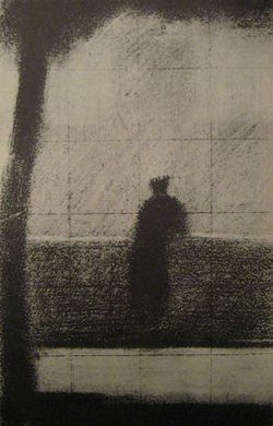
Image source www-3quarksdaily-com
Lightly grid out the good copy paper and then lightly add in the image.
Add in your value.
For your ‘good copy’ you can choose to hand in one large work(18×24″) or three medium works 8.5×11″
Advice:
Line drawing gets you started in visual art. Value drawing, also called “mass drawing,” takes you further. It bridges the gap between drawing and painting.
In a line drawing, the edges indicate the contours. Mass drawing defines the volume of the form and play of light on it. When done right, it teaches the sequence that will later be used for applying oil paints.
So if you are serious about learning to paint well, learning to read values is a must-have skill.
Suggested exercises for value drawing
Value painting is done best with pencil or charcoal. Soft or medium hardness charcoals work well for this. You will have to try different brands as I found early on that not all charcoals are equal. So, be choosy about your tools!
A line drawing is usually done on white paper with dark pencil or charcoal. A value drawing,on the other hand, often begins as a line drawing on toned paper with charcoal and white charcoal.
Some artists prefer to use white paper, which they then cover with powdered charcoal.
You can then add lines and use a kneaded eraser to wipe out areas for light spots and highlights. Either way works.
This drawing is done on the white paper, covered with charcoal. The highlights show once the charcoal is removed with a kneaded eraser.
Image source http://www.explore-drawing-and-painting.com/value-drawing.html
One exercise I find particularly challenging is to dispense with the line drawing completely and create the mass drawing directly.
Instead of drawing contour lines, in this exercise you use a large soft charcoal exclusively. Use the sides to lay down blocks of values. Don’t use the tips of the! This way you are not tempted to draw any fine lines.
If you don’t have suitable charcoal, then use a soft-leaded pencil to hatch or cross hatch until the desired area is saturated and then smooth it out with a soft brush
Below is an example of a value drawing on toned paper created with a broad piece of charcoal. For this drawing, I refrained from drawing lines where changes of tones occur. I just blocked in the rough contour of the form, and then I started right into creating the values.
Image source http://www.explore-drawing-and-painting.com/value-drawing.html
A good habit to develop is, when creating a tonal drawing, start from the dark values first.
Then move onto the middle tones, then the light tones, and finally the highlights.
Adopting such a methodical approach prepares you for painting in oils. This, however, is not a fixed rule.
Once you become proficient with ‘going from the darkest to the lightest’, you vary things however you like.
For example, I now usually start with two or three broad values in my drawings. These divide the composition into light and shadowy regions.
Next, I proceed to divide the two values into more values. On toned paper, the tone of the paper itself serves as a middle third tone between my light and dark tones.
Speaking of breaking the rules…sometimes I even start with two values first and then add the brightest light tone (when I get really excited about those juicy sparkling highlights!)
This way I know how my values should oscillate between the darkest dark and the brightest light.
When I first studied drawing, I worked at this type of value drawing for a long while before I was ‘allowed’ to paint.
If you have not done value drawings on toned paper before, you may find yourself hooked on it. It’s so nice that you do not have to fight the white all the time. Also, it seems to make it easier to get the tonal relationships right
Working from the darkest tones to the lightest forces me to slow down and take the time to compare tones carefully. I use a similar process when painting with oils, pastels, and oil pastels. It has become automatic.
In oil painting, you will sometimes hear the term ‘grisaille’, meaning a painting done entirely in shades of gray. It’s the oil equivalent of the tonal drawing. A strong tonal drawing almost always leads to a strong painting even though colors are not “right.”
So never underestimate the lessons you will learn from value drawing.
Some of the painters I know had to do this kind of study for a long time before they were allowed to touch colors. You might think, “What a grueling process! I just want to paint!” But there simply is no short cut if you want your paintings to really capture your subject.
(Source http://www.explore-drawing-and-painting.com/value-drawing.html)