
Curriculum objectives:
- Colour is an element of Art which students should have experience exploring
- Students should understand the Science behind Colour.
- Students should understand how we as individuals perceive colour.
- Students should understand how colour is used in artworks and everyday life
In this unit you will find the following sections:
- Intro to colour?
- The Science of colour
- The Perception of Colour, the perception of individual minds
- What is a Colour Wheel?
- Color Vocabulary and Terms:
- How to talk Colour
- Color Can Affect You Psychologically
- YOUR PERSONAL RELATIONSHIP WITH COLOR
- A few Artists/Art movements who dealt with Colour Theory:
- Task
- Excellent Websites on colour:
- Other conceptions of how to structures thoughts about colour
- More Colour Resources
Intro to colour:
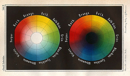
Image from http://www.colourlovers.com/
Wilhelm von Bezold’s 1874
Colour has a profound effect on us even though we may not be aware of it. Every day our emotions, moods, mental acuity and even physical sensations—such as appetite—are influenced by the colours that surround us.
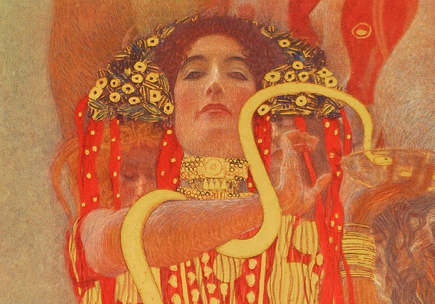
Artist G. Klimt. Image from http://www.austria.info/
Imagine that during the night while you were sleeping someone came and painted your walls and ceiling black. How would it make you feel as you began your day? Now imagine waking up to a bright sky blue, or a brilliant yellow, or a pale mint green. This is a good exercise to get a sense of how much colour can affect you.
Artists and designers—as well as advertisers—use colour very deliberately to make you feel a certain way. Ever wonder why McDonald’s uses so much red and yellow? The colours red and yellow stimulate appetite. Colour in the clothing you wear can also have an unconscious effect on others.
*How many Fast food restaurants use the colours below in their logo?

Image from https://designshack.net
Understanding the psychological and symbolic effects of colour, and colour theory–how colours relate to each other—can be a powerful tool not just in art, design, and advertising, but also in home decorating and personal style. A basic knowledge of colour can strongly enhance anyone’s life—professional or not. (https://www.sophia.org/tutorials/elements-of-art-color)
The science of colour.
The Perception of Colour, the perception of individual minds
image source newrepublic.com/article/121843/philosophy-color-perception Ibrahim Mohammad El-Salahi, “The Tree”
(If you are interested in our perception of colour here is an article for you! Does Color Even Exist? What you see is only what you see BY
image-source-newrepublic-comarticle121843philosophy-color-perception Artist Ibrahim Mohammad el Salahi. The tree
So from a scientific point, wavelengths of differing sizes can be labelled colours (ROYGBIV). The eye sees the colour of an object as white light is shone upon the surface of an object, which then reflects some colours and absorbs others. It is the reflected light – or wavelength, that is picked up by the eye. Therefore a strawberry is reflecting red light and absorbing all the other colours.
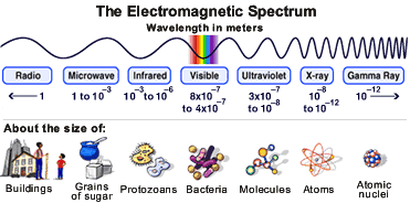
Image from http://hubblesite.org/
Within the eye, the retina contains receptors called rods and cones. The rods react to brightness, whilst the cones react to colour wavelengths. There are three types of cone; red, green and blue. Each colour has a different wavelength; blues, greens and violets have shorter wavelengths and reds, oranges and yellows have longer wavelengths. When coloured wavelengths fall on the retina, the nervous system and the brain interpret the signals as colour.
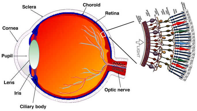
Image from www.biologymad.com
But the only way we see colours is if those wavelengths are reflected off an object instead of being absorbed by the object. Moreover, ‘colour’ only exists in our brains. Each of us may be interpreting ‘Colour’ in different ways and it is only through language that we able to assign a convention, a labels or words, to be able to communicate together.
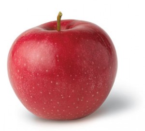
Image source edazdorov.ru
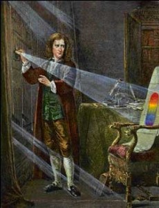
Image from http://munsell.com/
The color wheel’s roots date back to the mid-1600s when Sir Isaac Newton’s work with white light led him to the discovery of the visible spectrum of light. Newton observed the way each color of light would bend as it passed through the prism (*a prism is a 3 sided peice of glass- if you want to try this let me know). You may have learned the term “ROY G BIV” (red, orange, yellow, green, blue, indigo and violet) in elementary school science class. “ROY G BIV” was the result of Newton’s discovery. (http://munsell.com/color-blog/sir-isaac-newton-color-wheel/)
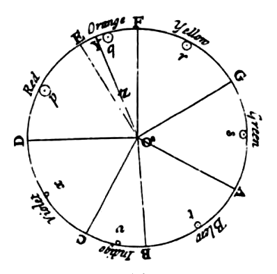
Image from wikipedia
In his original color wheel (1704), Sir Isaac Newton included musical notes correlated with color beginning with red and dividing the circle by the musical scale starting with D and ending with the octave of D. It was no surprise that violet and purple colors are located next to red on the color wheel, since these colors are considered non-spectral and mixtures of red and violet light. (Text from http://munsell.com/color-blog/sir-isaac-newton-color-wheel/)
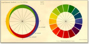
Image source khairunysarts.blogspot.com
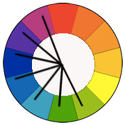
A colour wheel is disk-shaped and divided equally into 12 sections, each displaying a different colour according to its “pigment” values.
All colours arise from the three Primary Colours: red, blue and yellow. These colours are primary because you cannot make them by mixing other colours together. They are represented on the colour wheel at equidistant positions, forming a triangle.
Mixing equal values of any two primary colours together creates the Secondary Colours of violet, orange and green. Since violet is a combination of equal amounts of blue and red, it lies halfway between those two colours on the colour wheel. Orange lies halfway between red and yellow, and green between yellow and blue. The secondary colours form another triangle.
Color Vocabulary and Terms
Below are the most widely used terms for describing colour
Spectrum: All the possible colours in a colour space. (Visible spectrum)
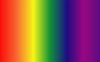
Image source www.livescience.com
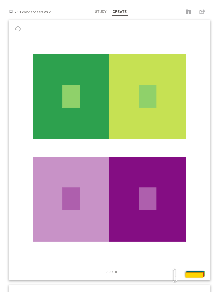
Colour or Hue: This defines the specific location on a colour wheel or in the colour spectrum. If you were to select a red area in the colour spectrum, you have chosen a red hue.
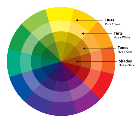
image source color-wheel-artist.com
Tint: This is the process of adding white or light to a colour.
Shade: This is the process of adding black to a colour.
Tone: This is the process of adding grey(black and white- or tints and tones) to a colour.
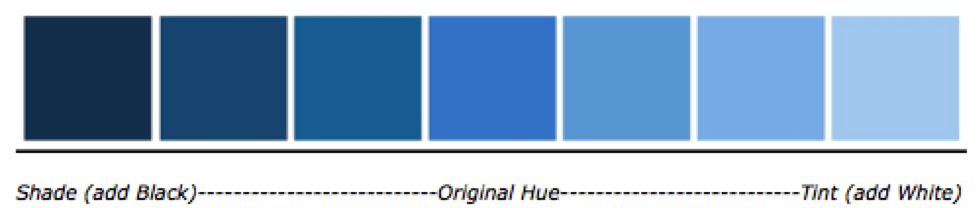
Image from https://courses.byui.edu/art110_new/art110/glossary/glossary.html
Value: This describes the range from dark to light, a Blue hue could be shown at varying values. It could vary from light to dark, where the dark would be a traditional Blue colour, and the light would be a very powder blue.
Saturation: This defines the intensity of the colour, and can sometimes actually be referred to as intensity.
Muted: When a person is describing muted colours, they are often referring to colours that have low saturation or colours that they deem to be of low intensity.
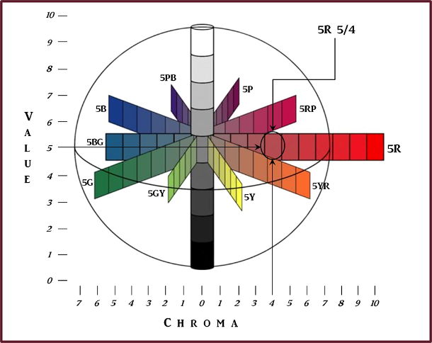
Image from https://notanothergardeningblog.com/tag/munsell-colour-system/
Contrast: This is probably most important when trying to determine the readability of the design. You want to have high contrast colour choices for your text areas, where the separation between two colours on the spectrum is high enough to allow for an easy read. If you were to put a purple colour on a turquoise background, for instance, the readability would be affected negatively.
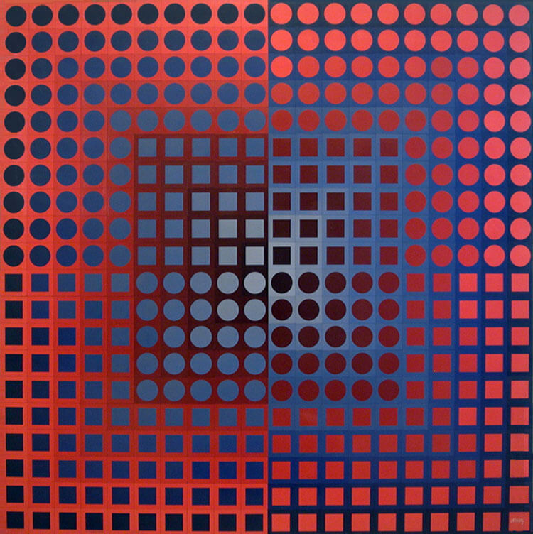
Image from https://www.masterworksfineart.com
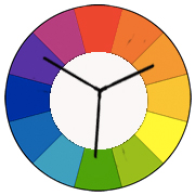
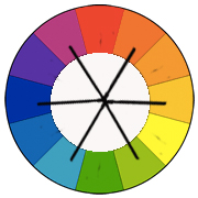
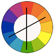
Colour Wheel: a circle with different coloured sections used to show the relationship between colours.
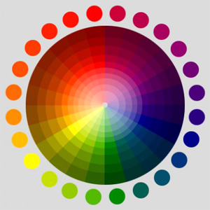
Image source http://misterriggs.com/archives/831
Colour Schemes are the choice of colours used in design or artwork
Primary Colours: red, blue and yellow. These colours are primary because you cannot make them by mixing other colours together.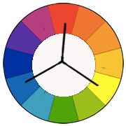
Secondary Colours like violet, orange and green are made by mixing equal parts of primary colours
Tertiary Colours are made by adding equal amounts of one primary and one secondary colour,
Complementary Colours are colours that are directly opposite each other on the colour wheel, such as red and green or blue and orange.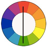
Split Complementary scheme is a variation of the complementary colour scheme. In addition to the base colour, it uses the two colours adjacent to its complement. 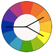
Double Split Complementary are the four colours on either side of a pair of complementary colours on the colour wheel.
Triad A triadic colour scheme uses colours that are evenly spaced around the colour wheel.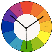
Analogous Colours are groups of three, or more, colours that are next to each other on the colour wheel.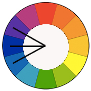
Monochromatic colours are all the colours (tints, tones, and shades) of a single colour or hue.
Warm Colours are colours that appear warm to the eye/brain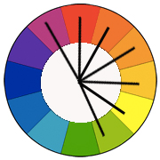
Cool Colours are colours that appear cool to the eye/brain
Intermediate colours
How to talk Colour
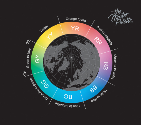
Image source https://ihueman.wordpress.com/
YOUR PERSONAL RELATIONSHIP WITH COLOR
The psychological effects of colour are different for each person. The way you use colour becomes part of your personal style. Before getting into the details of colour theory, take some time to consider your relationship with colour and how you might use it as an expression of your individuality.
Following are a few fun exercises designed to help you discover how you feel about colour.
A. What colour is emotion?
What colour do you see in your mind when you think of/imagine feeling the following emotions:
1. Anger
2. Sadness
3. Excitement
4. Anxiety
5. Love
6. Fear
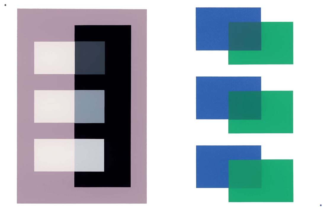
Image source http://yalebooks.co.uk/ Artist Josef Albers
B. What colors are your personality?
List 5 aspects of your personality (i.e. easy-going, optimistic, friendly, shy, etc)
1.
2.
3.
4.
5.
Now imagine a colour for each aspect of your personality. Using those colours, make a rainbow, a crystal, or a design that represents your personality. Use types of lines and shapes that seem to go with the aspects of your personality and their colours.
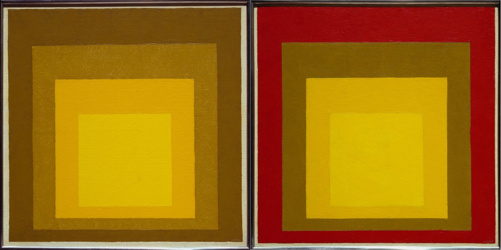
Image source http://www.smithsonianmag.com/ Artist Josef Albers
C. What colour is a belief or idea?
- Think of something you believe in or a philosophy about life that you feel strongly about.
- List words that describe or go along with that idea or belief.
- Let yourself really go into it, what you believe, and let yourself feel the feelings you have about what you believe in.
- Now choose colours that seem to fit what you believe in. Again, use lines and shapes and a design that seems to go along with the belief and the colours you chose.
- In your design, avoid using existing symbols or objects that represent your belief. Make up your own.
Image source http://tina-m.blogspot.ca/ Artist Josef Albers
D. What colour would you wear to feel…
1. Powerful
2. Disguised (Fitting into the environment and not being noticed)
3. Serious
4. Professional
5. Fun
6. Attractive
7. Competent
8. Wild
9. Compassionate
10. Boring
(Above Text from https://www.sophia.org/tutorials/elements-of-art-color)
Color Can Affect You Psychologically (Although it’s Hard to Prove)
I think that all of us can agree that colour does affect our psyche. It is quite hard to prove this however, if you are the scientific type. Despite this, there have been several attempts over the years to prove the connection between colour and psychology. Neuropsychologist, Kurt Goldstein experimented with the affects of colour on one’s psyche in the 1930’s. These experiments yielded some interesting results on how colour affects us. For example, the experiments showed that objects seen in red light appear bigger or heavier. In contrast, objects that were viewed in the opposite colour, green, appeared smaller and lighter.{adinserter 5}
Here are a few more ways colour is thought to have had an impact on psychology…
Fact 1 – A factory in the United States changed the colour of the bathrooms to an unpleasant green and saw production increase by 8%. (*Remember the Bell lighting study)
Fact 2 – Customers of a coffee house constantly complained about the cool temperature in the room. At that time, the walls were painted a light blue. After changing the colour to orange, there were no more complaints.
Fact 3 – The colour yellow can cause nausea, so it is avoided in aeroplanes.
Fact 4 – Black boxes seemed heavier to workmen than green boxes filled with the same material.
Fact 5 – Red can make you hungry, while the opposite colour, green, suppresses it.
Fact 6 – The colour red can also increase your muscle reaction, make you want to gamble more, and raise your blood pressure. Blue has the opposite effect.
Fact 7 – Blue street lighting resulted in lower crime rates in Glasgow in 2000.
Fact 8 – Blue conveys trust and reliability.
Fact 9 – Green is believed to increase concentration.
I came across these interesting facts about colour in my research and I thought that I’d pass them on. While colour does have an impact on our psychology, we bring our own experiences to the table making colour psychology an imperfect, but fun science.
A few Artists/Art movements who dealt with colour theory:
Josef Albers 1888 to 1976
Fauvism 1905 to 1908
Victor Vasarely 1906 to 1997
Abstract Expressionism 1940s-60
Colour Field Painting Late 1940s- late 60s
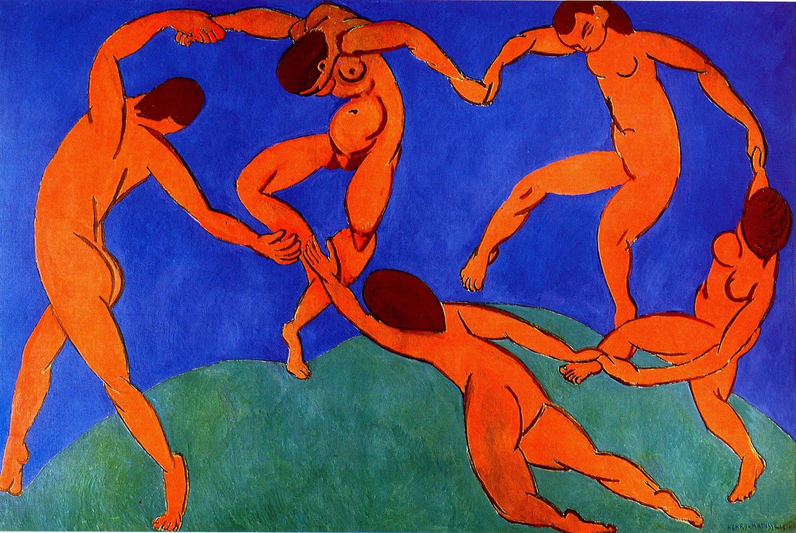
Image source www.studyblue.com Artist H. Matisse La Danse (1910)
Task:
Complete a the Colour Wheel with Tints and Shades Value charts.
I will be assessing your work on the fluidity of transition from one colour to another.
*You are welcome to make your own colour wheel instead of the handout.
Excellent Websites on colour:
Color systems (WOW! SO MUCH INFO ON THIS SITE!!!)
Causes of Color
The History of the Colour Wheel
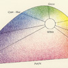
Other conceptions of how to structures thoughts about colour:
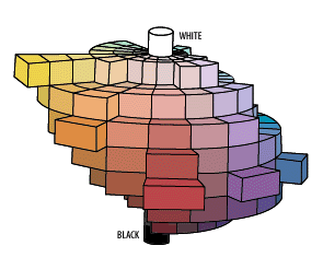
Image source http://www1.appstate.edu/
Hermann Von Helmholtz image source www,color-systems
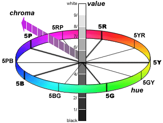
image-source-www1-appstate-edu329 By Munsell
Image source www.synaesthesiewerkstatt.de
Image source https://exemplore.com/
Image source www.pinterest.com
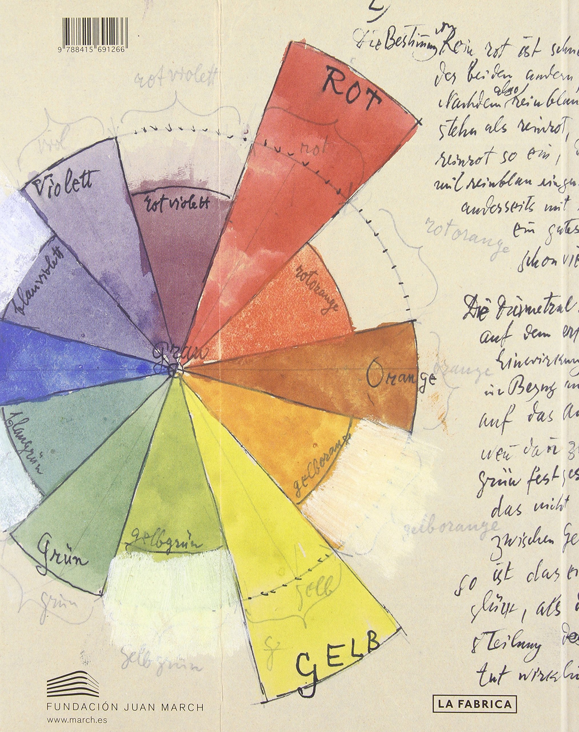
Image source www.amazon.in
Image source www.Pinterest
Image source http://www.bestinfographics.co/
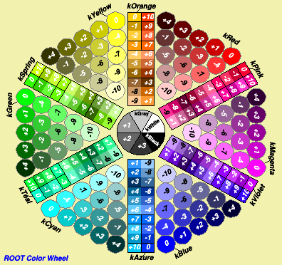
Image source https://root.cern.ch/doc/master/classTColor.html
More Colour Resources
___________________________________