Typography is much more than just graphic design or illustration with some text thrown in. It’s an art form in itself that combines carefully chosen and arranged fonts with visual elements, sometimes as a relatively straightforward communication device and sometimes as artistic expression.
Si Scott- I Love his WORK!!!
Si Scott at the GAP in Oakridge How now is this?
 By S SI
By S Si
by RenzGFX
Please take a look at these articles:
60 Amazing Typography-Based Posters
I LOVE TYPOGRAPHY #7
Here is a very good summation about Typography
THE ART OF TYPOGRAPHY[http://www.artyfactory.com/graphic_design/typography/the_art_of_typography.htm]
The original meanings of the words ‘Typeface’ and ‘Font’ have become blurred through common usage . Both now tend to be used to describe the various styles of letterforms available to designers and printers.
TYPEFACES
The term ‘Typeface’ was originally used to identify the design elements in a letter style e.g. bold, underlined, or italic.
Bold Type can add an emphasis or strength to the style of a font.
Underlined Type is an effective way of emphasising the title of a document. It can also be used to call attention to an important section of text.
Italic Type can also emphasise an important word or passage of text, but it tends to be used in a more informal context. Italic fonts have an animated style and are often selected for designs where there is a need to convey the illusion of speed and energy.
FONTS
The term ‘Font’ was originally used to identify a family of typefaces. The fonts below are all members of the ‘Futura’ font family. Their height is measured in points – the standard unit for printed text. There are about 72 points to one inch.
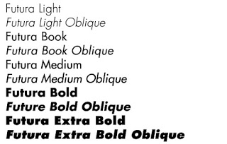
by Paul Renner
Although the above fonts are all the same height, note how their breadth varies according to their style. Some fonts are more suited to fitting into a confined area of a design, while others like to spread themselves out.
There are two main font types:
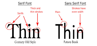
image sourse visualhierarchy.co
Serifs are the extended corners at the ends of a letter and like all good design, they have evolved naturally. They originated in the stone-carved letters of the Ancient Romans. Stone masons discovered that it was technically easier to finish chiseling the ends of a letter in a slow curve. Not only did serifs look more elegant but they were also very practical as they formed a natural channel for water or rain to flow away as it cleaned dust from the corners.
Serif fonts are the most legible and are commonly used for large blocks of text. Their wide horizontal baseline emphasises the line of text for the eye and makes reading more comfortable.
Sans-serif fonts are simply fonts without serifs (‘sans’ means ‘without’ in French). They are also sometimes called gothic fonts.
Fonts are usually selected for either their legibility or their stylistic effect.
THE LEGIBILITY OF A FONT
Legibility is the measure of how quickly a font can be read. The balance between legibility and style is one of the important factors to be considered when choosing a font for a design.
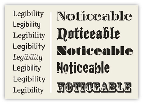
Image source paperspecs.com
Serif fonts like Times New Roman above are the easiest to read. They usually appeal more to an older target audience who are more concerned with content than style.
Image source reinhardtart235.wordpress.com
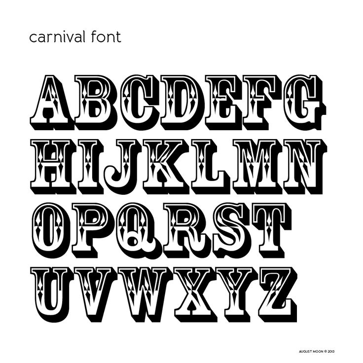
Novelty fonts like Carnivale are fun but are less legible and tend to date quickly. They tend to appeal more to a younger target audience who often prefer style over content.
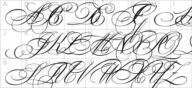
Image source m.font.downloadatoz.com/font,77917,bickham-script-fancy-2/
Calligraphic or script fonts, especially in capitals, are often the most illegible.

Image source artyfactory.com
The choice of colour can also have a strong effect on the legibility of a font.
THE STYLE OF A FONT
Fonts can speak in a voice that reflects the style or emotion of the words they make. The elements of shape and colour help to communicate their meaning.
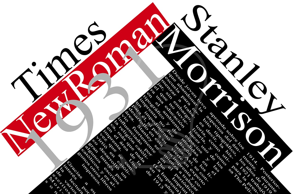
Image source http://luc.devroye.org/fonts-61238.html
Based on the carved letterforms on the buildings of Ancient Rome and used as the typeface of The Times newspaper today, the ‘Times New Roman’ font represents the voice of authority. This idea is reinforced here by its dark blue colour – the colour of law enforcement.
‘Times New Roman’ was designed in 1931 by British designers Stanley Morison and Victor Lardent. However, certain authorities now dispute this and believe it to be the work of the American designer, Starling Burgess.
Image source www.ffonts.net/Bedrock-Light.font
Various elements contribute to the sense of disorder in the ‘Bedrock’ font above. The primitive shape of each letterform is chiseled to form a crooked design, while the irregular arrangement and different colours heighten the effect.
Designed in 1995, it was probably inspired by ‘The Flinstones’ who lived in Bedrock, and it reflects the anarchy of a cartoon world.
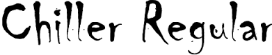
image source corrinedartnell.blogspot.ca/
Anger is expressed in the aggressive and calculatingly crude calligraphy of the ‘Chiller’ font. It’s dangerous aura is amplified by the symbolic use of red – the colour of rage.
‘Chiller’ was created by the British designer, Andrew Smith.
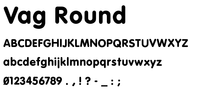
Image source www.pickafont.com/fonts/Vag%20Round.html
An ice cold blue colour, smooth rounded corners and a long relaxing shadow, all contribute to the feeling of calm in the ‘VAG Rounded BT’ font.
BT stands for Bitstream, the company from Cambridge MA, USA who designed the font.
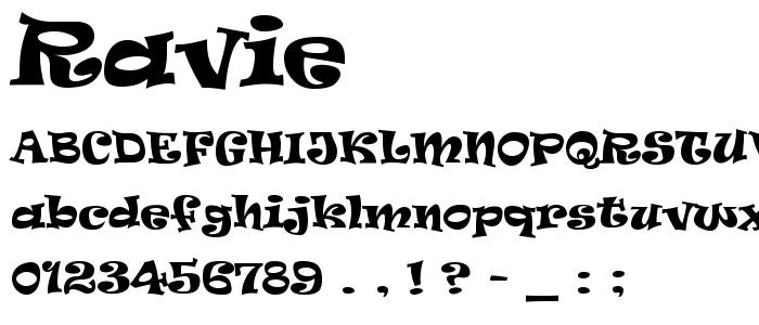
image source www.pickafont.com
‘Ravie’ has the energy and bouncy movement necessary for a fun-filled font. Bright primary colours enhance its cheerful form.
‘Ravie’ was designed by Ken O’Brien in 1993-94 at the Art Center in Pasadena, California.
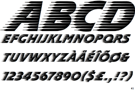
Image source www.identifont.com
The combination of italic type, graduated colour and blurred form creates the illusion of speed using the ‘Slipstream LET’ font.
Slipstream was designed by the Letraset Type Studio.

Image source www.freefontsdownload.net
By their nature bold fonts shout. ‘Futura XBlk (extra black) BT’ is a no nonsense, sans-serif font that gets its message across loud and clear.
Paul Renner (1878-1956), a typographer associated with the Bauhaus in Germany designed the original Futura fonts. They were the most popular sans-serif fonts in the first half of the 20th century.
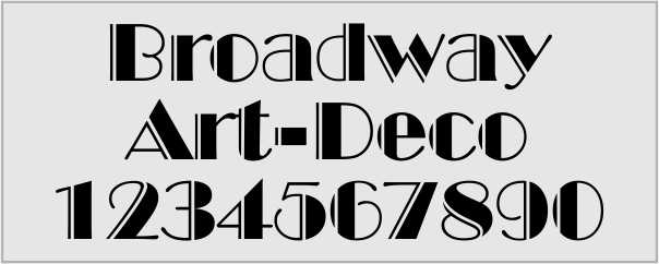
Image source stoneengravings.co.uk
Certain fonts inherit a reputation for style through their association with a particular time or place. ‘Broadway Engraved’ evokes the Art Deco era which was one of the most popular design movements of the early twentieth century. A metallic gold finish completes the stylish look.
This font is based on ‘Broadway’ which was designed by Morris Fuller Benton between 1925-28.
The interaction between the abstract elements of positive shape and negative space is an important consideration in the design of good typography.
POSITIVE SHAPE – NEGATIVE SPACE
By positive shape we mean the shape of the letter itself.
By negative space we mean the background shapes between the letters.
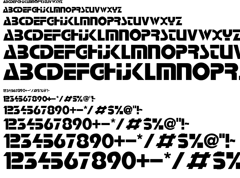
Image source fonts.radio-electronics.co
Equally balanced positive shapes and negative space interlock to create a strong architectural quality in the Logan font.
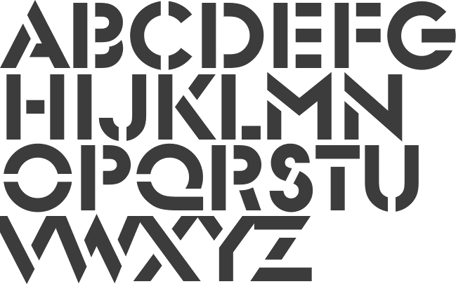
Image source luc.devroye.org
If you look closely you will see that a little trickery has been used to manipulate the positive shapes and negative space of this Stencil font.
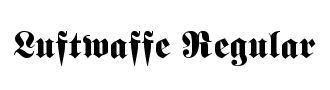
Image source www.freefontsdownload.net
A careful balance between positive and negative elements was essential to create the rhythm and vitality of this script font. Script or calligraphic fonts, like Luftwaffe, should be avoided if you are looking for legibility.

image source www.pickafont.com
Ravie is a fun font for those who place stylistic effect over legibility. Although it looks improvised and intuitive, there is a calculated balance between its positive shapes and negative spaces. This effect is made more visible by the circle which highlights its animated and abstract qualities.
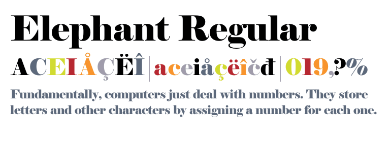
Image source fonts.com
The elephant is a beast of burden and the Elephant font reflects this quality. Like steel girders, its characters look to be able to support a great weight. The balance between the strength and delicacy of their positive and negative forms adds a sense of refinement to this typographic powerhouse.
Image source www.fonts101.com
The interaction between the positive and negative shapes of the Wide Latin font evokes the dynamic forms of Geometric Abstraction in mid 20th century painting.
From artyfactory.com
Try out our graphic design lessons on:
Some Excellent design/style sites:
An Exciting Showcase of 2009 Logo Trends
25-gorgeous-graphic-designer-folios
Black & White Typography–Wonders of Graphic Design
100 Great Resources for Design Inspiration
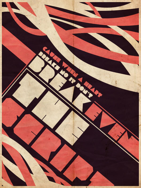
by Craig Ward